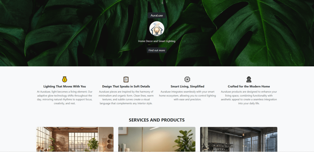
• Developing a polished product landing page from a wireframe requires striking a balance between visual appeal and structural efficiency. For my latest front-end assignment, I constructed a comprehensive showcase for AuraLuxe, a fictional ambient home décor and smart lighting brand. The core objective was to move away from writing custom CSS grids from scratch and instead leverage a robust framework, Bootstrap 5.

    The Challenge and Framework Choice

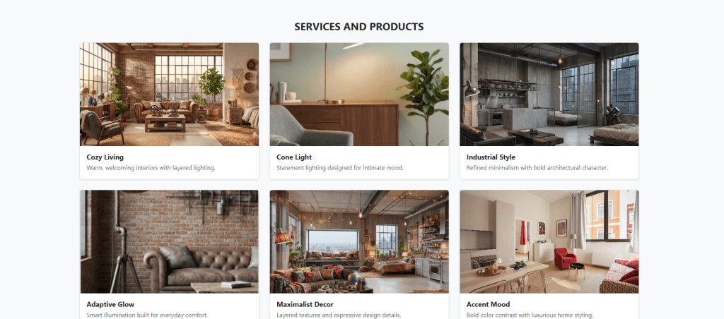
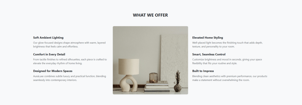
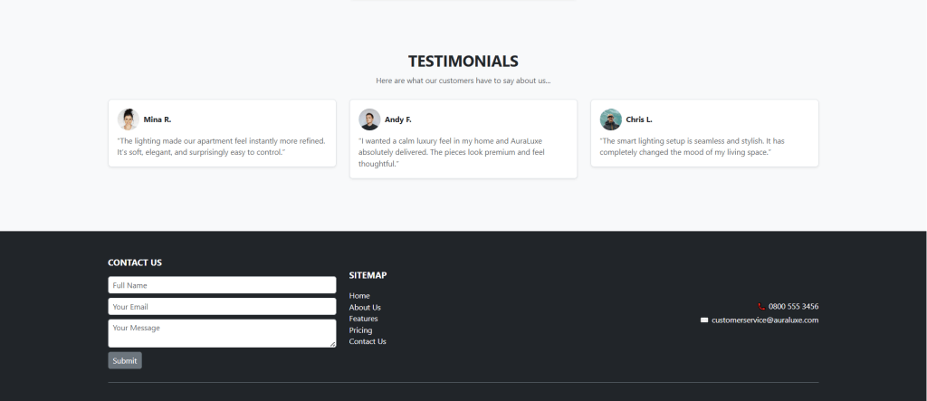
    The wireframe outlined a content-dense layout consisting of six distinct sections: a prominent hero banner, a four-column feature icon row, a 3×2 product grid, a three-column split breakdown, a customer testimonial section, and a detailed footer containing a contact form and sitemap.

    treamlining Layouts with Bootstrap Grid

    The backbone of the AuraLuxe interface relies on Bootstrap’s .container and .row components combined with responsive column classes (such as col-md-4).

    As the viewport narrows on mobile devices, Bootstrap’s built-in breakpoint rules automatically stack the elements vertically, preventing horizontal scrolling or content clipping without requiring custom media queries in a separate stylesheet.

    Asset Management and Semantic Structure

    Despite relying on a framework, maintaining semantic HTML5 structure is essential. The document uses the appropriate elements (<header>, <section>, <main>, <footer>, and <form>) to ensure screen readers and search engines can access and parse the content. Placeholder image containers were styled using muted background tones to show media placement without breaking the visual flow during testing.

    The Takeaway

    Overall, this was one of the more challenging and engaging websites I have created. The AuraLuxe project demonstrates how modern CSS frameworks can dramatically reduce development time for content-heavy enterprise pages. The live site can be found here.

    + ,
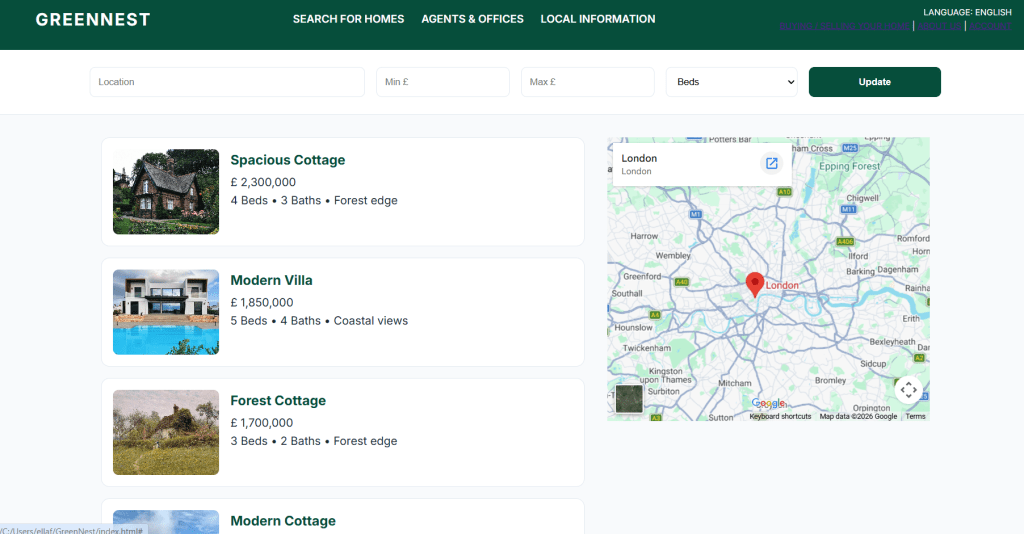
  • For this assignment, I developed GreenNest, a demo property search platform designed to streamline the discovery of homes. The primary objective was to move away from cluttered interfaces towards a layout that prioritises user intent and visual hierarchy.

    A Two-Tiered Layout Strategy

    The main design challenge was organising a high volume of search controls without overwhelming the user, and using iframe. By using Flexbox and CSS Grid, I was able to stack these complex components while maintaining a logical reading order.

    Technical Implementation and CSS Grid

    The interface relies on CSS Grid for the property listing columns and the integrated map view. This approach offers significant advantages for responsiveness. As the viewport narrows, the layout transforms to stack content vertically.

    I utilised the object-fit: cover property for property images. This ensures that the photos, regardless of the source aspect ratio, is presented within the UI.

    Visual Branding and Performance

    I opted for a ‘Deep Green’ colour scheme, implemented using CSS variables.

    Performance was considered throughout the build. By keeping the CSS modular and minimising external dependencies, the platform remains lightweight. The use of sticky positioning on the search bar shows that filtering options are always accessible to the user.

    The demo site can be found here.

    + ,
  • Designing an image gallery often leads to rigid layouts where every photograph is forced into identical square containers. For my latest portfolio challenge, I wanted to avoid this constraint by constructing a custom landing page for Velvet Paw Portraits, a fictional pet photography studio.

    The primary challenge was balancing an asymmetric, creative design with clean, maintainable code.

    CSS Grid as the Foundation

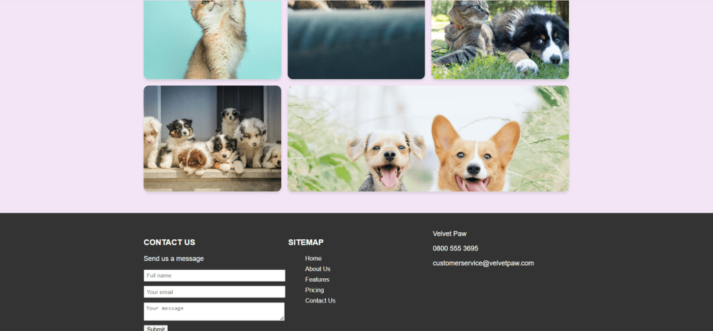
    Before writing any styles, I established a clear HTML structure complete with a top navigation bar and a semantic gallery container. Rather than relying on Flexbox for a two-dimensional layout, I utilised CSS Grid.

    The key feature of this build is the use of grid-template-areas. By mapping out the rows and columns directly within the CSS, I could precisely place which photograph occupied a vertical slot and which occupied a horizontal space.

    Smooth Micro-Interactions

    A professional portfolio website should provide visual feedback when a user interacts with elements. I incorporated a subtle zoom effect for each gallery item using the CSS transform property combined with a smooth transition duration. When hovering over a portrait, the image scales up gently, offering immediate feedback without disrupting the page structure or causing layout shifts.

    You can find the demo website here.

    + ,
  • Layout design is a core skill for any front-end developer. For this portfolio piece, I challenged myself to build a landing page for ‘Form & Flow’, a fictional architecture studio, using only CSS Flexbox.

    The Challenge

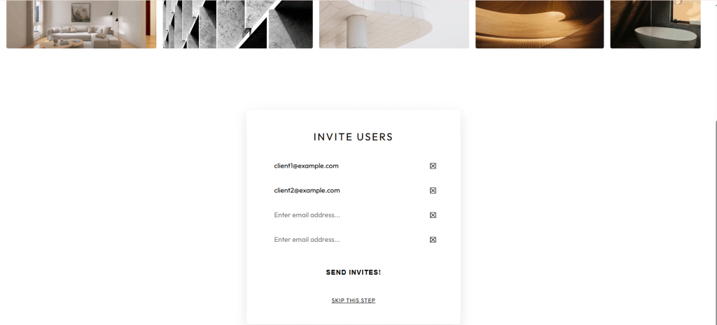
    The wireframe needed a complex masonry-style gallery at the top and a structured invitation form at the bottom. The goal was to keep a good visual hierarchy while ensuring the components remained easy to maintain.

    The Technical Execution

    The gallery was the most significant hurdle. Since Flexbox is primarily a single-axis layout tool, I used a nested strategy. I treated the gallery as a flexbox row containing four vertical columns. By setting each column to flex-direction: column, I could control the vertical stacking of the images.

    To maintain a consistent look for the images, I used the object-fit: cover property. This ensures that every image fills the containers perfectly, regardless of its original aspect ratio. This prevents the images from looking stretched or distorted.

    For the contact portal, I used Flexbox to manage the input fields. By applying flex-grow: 1 to the input elements, the typing area automatically expands to fill the available width. This pushes the action icons to the far edge, ensuring a consistent and clean look for the entire form.

    Overall, building this project reinforced that Flexbox is a versatile tool for complex layouts, provided you are willing to nest containers well. The demo site can be found here.

    + ,
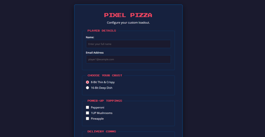
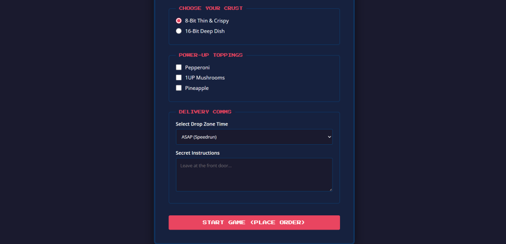
  • Web forms can be tricky to style. For my latest portfolio challenge, I built a custom order form for Pixel Pizza, a fictional retro arcade pizzeria.

    Semantic HTML as the Foundation

    Before writing any CSS, I structured the form using semantic HTML. Every input is wrapped in a <fieldset> to group related data, and every input has a dedicated <label> linked via the id attribute.

    This improves the user experience significantly. By linking the label, clicking the word “Pepperoni” ticks the box next to it.

    Focus States and Visual Feedback

    A crucial part of form design is letting the user know exactly where they are. I used the :focus pseudo-class to remove the browser’s default blue outline when a user clicks into a text box. I replaced it with a bright pink border that matches the Pixel Pizza branding.

    Overall, this portfolio project really challenged me to really think about accessibility when designing for web browsers.

    The full project can be found on my GitHub Pages. If you are interested in the build, the repository is linked here.

    + ,
  • For my latest portfolio project, I decided to strip all of that away. The brief was simple but intimidating: build a visually engaging webpage using nothing but text.

    To tackle this, I created ‘Syntax Coffee Co.’, a fictional specialty roastery. The goal was to guide the user’s eye down the page purely through font choices, scale, and spacing. Without images to lean on, every CSS rule had to be intentional.

    Establishing the Hierarchy

    I paired three Google Fonts to create a clear, tiered structure:

    • The Anchor: Bebas Neue provided the massive, heavy, condensed impact needed for the primary hero text.
    • The Accent: Playfair Display offered an elegant, italicised contrast for secondary focal points.
    • The Foundation: Inter kept the dense body copy clean and highly legible.

    The demo site can be found here.

    + ,
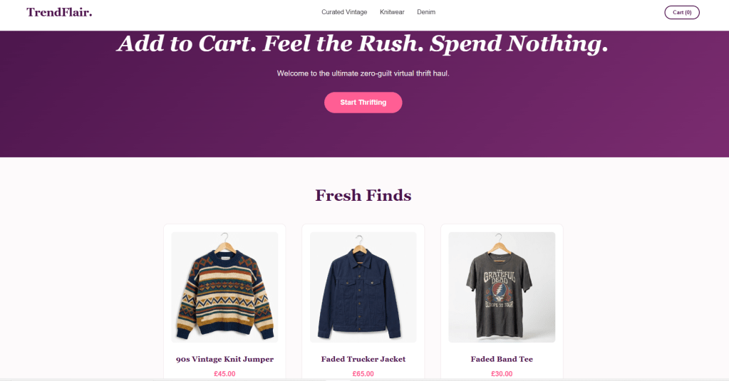
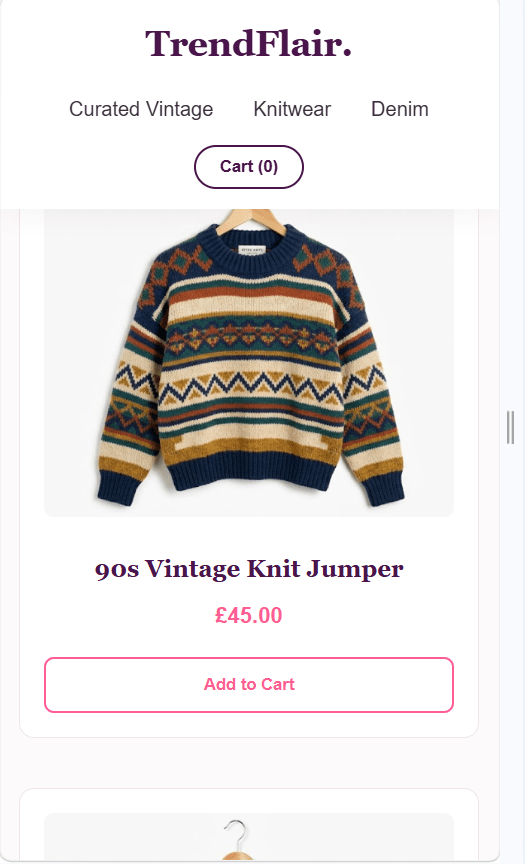
  • I’m really excited to share my latest project, TrendFlair—a demo web application designed to simulate the modern online thrift-shopping experience. My goal with this project was to create an ecommerce layout with an engaging user experience. This was also inspired by a new trend called ‘Dopamine Sites’, where users can ‘fake’ shop online.

    Since a large percentage of fashion discovery happens on smartphones, mobile optimization was my top priority. I utilized CSS Mediaquery to create a responsive layout that automatically adjusts to various screen sizes.

    To drive user engagement, I wanted the primary call-to-action—the “Start Thrifting” button—to stand out immediately.

    This is part of a Web Development course I am currently undergoing. This is my submission for Challenge 2: Responsive Design.

    Interested in the code?
    You can check out the full repository for TrendFlair over on my GitHub profile. I’d love to hear your thoughts on the design choices!

    + ,
  • It has been a really productive day of coding. After getting my first chart working in the last blog post, I wanted to turn it into a proper dashboard where everything reacts to what the user clicks.

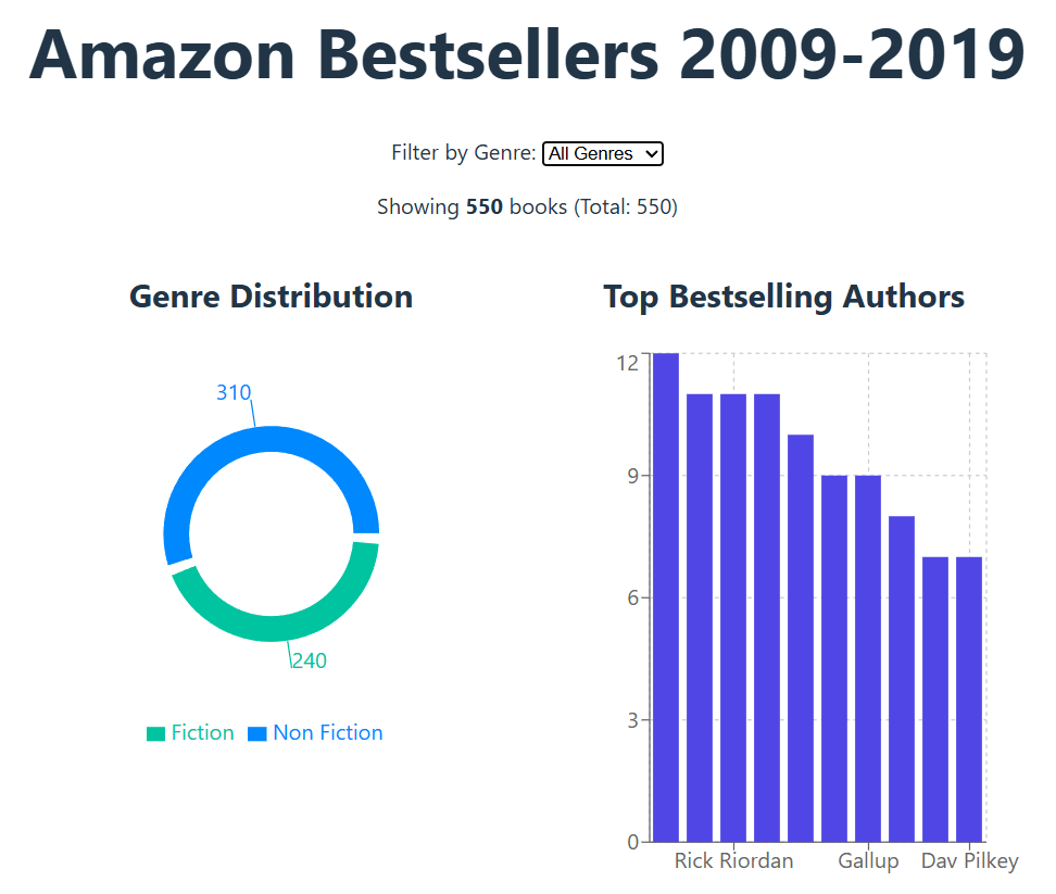
    The first big job was changing how the data travels through the app. Instead of each chart doing its own thing, I moved all the logic to the main part of the app. This means I now have one central “brain” that filters the list of books and sends that information down to the charts.

    This was a game changer because it let me add a dropdown menu. Now, you can choose to look at just Fiction or Non-Fiction, and the charts instantly update to show the right numbers.

    Fixing the Bugs

    It wasn’t all smooth sailing. I ran into a few common React errors where the screen went blank because the data wasn’t loading fast enough. I had to add some “safety checks” to the code to tell the charts to wait until the data arrived before trying to draw anything. I also had a few typos that caused the app to crash, but fixing them helped me understand how everything connects together.

    What’s Next?

    The dashboard is starting to look great. You can filter the books and see the charts change right in front of you. I am planning to add a year slider next so you can look at specific time periods, like just the bestsellers from 2010 to 2012.

    +
  • Following my previous post outlining the decision to embark on a book data visualisation project, work has now commenced on building the interactive application. The first crucial step involved preparing the “Amazon Top 50 Bestselling Books 2009-2019” dataset. This careful preparation ensures the information is ready for use, forming the essential foundation for all the visual displays that will follow. With the book data now properly organised within the project, the journey of creating an interactive experience has begun.

    A key decision at this stage was choosing the right tool to draw the charts. After looking at several options, I settled on Recharts. This particular library works exceptionally well with React, the framework I’m using to build the website. It makes the process of creating charts straightforward and efficient, allowing me to focus on what the data shows rather than getting bogged down in complex drawing instructions. This choice helps ensure the visualisations are clear and perform smoothly.

    The first part of the project involves a chart showing the top bestselling authors. To create this, I took the raw book information, counted how many times each author appeared on the bestsellers list, and then arranged that information. This prepared data is then used by Recharts to automatically draw a clear bar chart, immediately showing which authors were most popular over the decade. Getting this first chart to work successfully confirms that the data is flowing correctly and the chart-drawing tool is integrated properly.

    The next stage of development will involve creating more visualisations to explore different aspects of the book data. Each new insight will require me to prepare the data in a specific way and then build a new section for the website to display it. For example, I will be creating a line chart to illustrate how the average reader ratings of bestsellers have changed year by year. This will offer a clear view of how public opinion on books has shifted over time. Additionally, a pie chart will be designed to show the split between fiction and non-fiction books within the dataset, providing a simple way to see genre dominance. These additions will not only make the application more insightful but also demonstrate my ability to handle different types of data presentation.

    Future plans include adding interactive features, allowing visitors to easily filter the data by criteria such as publication year, genre, or reader rating. This commitment to an engaging user experience, alongside a consistent documentation of each development milestone on this blog, highlights the comprehensive nature of this portfolio project.

    +
  • After careful consideration of my next portfolio project, I am now proceeding with a data visualisation initiative that will demonstrate my full-stack and user experience design capabilities. The objective of this project is to create a compelling, long-term asset that not only showcases my technical skills but also provides a structured foundation for my blog content.

    Initially, I had planned to develop a music data visualization tool using a Kaggle dataset. This concept offered a clear pathway for demonstrating key front-end skills. However, upon further review, I determined that a more personal and data-rich subject would lead to a more impactful and unique outcome. Instead, I have decided to pivot the project to focus on book reading habits.

    I will be utilising a Google dataset that I have previously engaged with, which is currently hosted on my GitHub. This dataset is a superior choice, as it provides a comprehensive range of data points beyond simple titles and authors, including publication dates, genres, and reader ratings. This shift in focus ensures a deeper and more meaningful analysis, allowing for the development of a more sophisticated application.

    The project will be built using React, with the primary goal of creating a series of interactive data visualizations. I intend to leverage a charting library such as Nivo or Recharts to present the data effectively, from a chronological timeline of my reading history to heatmaps illustrating genre preferences over time. My background in UX design will be critical in ensuring that the visualisations are not only accurate but also intuitive and user-friendly. This project provides a robust platform for demonstrating my ability to manage complex datasets, construct a resilient front-end, and design a compelling user experience.

    Throughout the development process, I will be documenting my progress on this blog. My posts will detail the project’s evolution from its inception to its final implementation. I will cover technical challenges and their resolutions, from setting up the React environment to the methodologies employed for data cleaning and the rationale behind my design choices. This project serves as an opportunity to both refine my technical skills and articulate a compelling story through data.

    +