
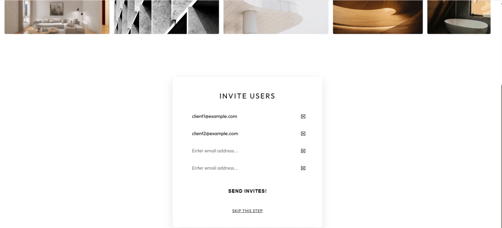
Layout design is a core skill for any front-end developer. For this portfolio piece, I challenged myself to build a landing page for ‘Form & Flow’, a fictional architecture studio, using only CSS Flexbox.
The Challenge
The wireframe needed a complex masonry-style gallery at the top and a structured invitation form at the bottom. The goal was to keep a good visual hierarchy while ensuring the components remained easy to maintain.
The Technical Execution
The gallery was the most significant hurdle. Since Flexbox is primarily a single-axis layout tool, I used a nested strategy. I treated the gallery as a flexbox row containing four vertical columns. By setting each column to flex-direction: column, I could control the vertical stacking of the images.
To maintain a consistent look for the images, I used the object-fit: cover property. This ensures that every image fills the containers perfectly, regardless of its original aspect ratio. This prevents the images from looking stretched or distorted.
For the contact portal, I used Flexbox to manage the input fields. By applying flex-grow: 1 to the input elements, the typing area automatically expands to fill the available width. This pushes the action icons to the far edge, ensuring a consistent and clean look for the entire form.
Overall, building this project reinforced that Flexbox is a versatile tool for complex layouts, provided you are willing to nest containers well. The demo site can be found here.


Leave a Reply