Following my previous post outlining the decision to embark on a book data visualisation project, work has now commenced on building the interactive application. The first crucial step involved preparing the “Amazon Top 50 Bestselling Books 2009-2019” dataset. This careful preparation ensures the information is ready for use, forming the essential foundation for all the visual displays that will follow. With the book data now properly organised within the project, the journey of creating an interactive experience has begun.
A key decision at this stage was choosing the right tool to draw the charts. After looking at several options, I settled on Recharts. This particular library works exceptionally well with React, the framework I’m using to build the website. It makes the process of creating charts straightforward and efficient, allowing me to focus on what the data shows rather than getting bogged down in complex drawing instructions. This choice helps ensure the visualisations are clear and perform smoothly.
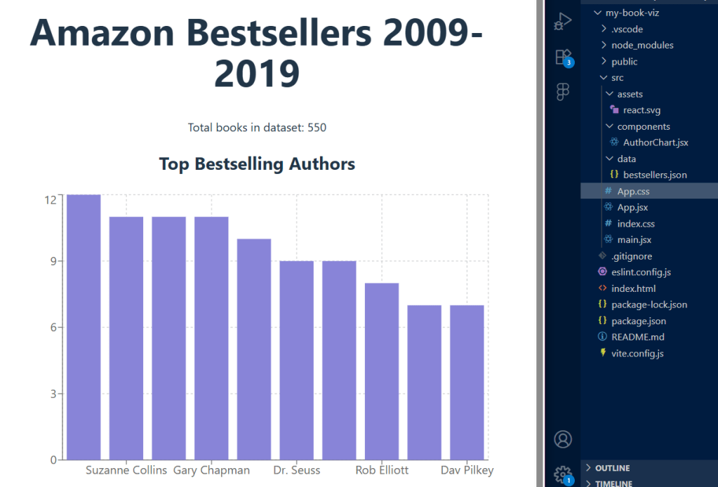
The first part of the project involves a chart showing the top bestselling authors. To create this, I took the raw book information, counted how many times each author appeared on the bestsellers list, and then arranged that information. This prepared data is then used by Recharts to automatically draw a clear bar chart, immediately showing which authors were most popular over the decade. Getting this first chart to work successfully confirms that the data is flowing correctly and the chart-drawing tool is integrated properly.
The next stage of development will involve creating more visualisations to explore different aspects of the book data. Each new insight will require me to prepare the data in a specific way and then build a new section for the website to display it. For example, I will be creating a line chart to illustrate how the average reader ratings of bestsellers have changed year by year. This will offer a clear view of how public opinion on books has shifted over time. Additionally, a pie chart will be designed to show the split between fiction and non-fiction books within the dataset, providing a simple way to see genre dominance. These additions will not only make the application more insightful but also demonstrate my ability to handle different types of data presentation.
Future plans include adding interactive features, allowing visitors to easily filter the data by criteria such as publication year, genre, or reader rating. This commitment to an engaging user experience, alongside a consistent documentation of each development milestone on this blog, highlights the comprehensive nature of this portfolio project.
